
Whenever you walk into a well decorated home, there is always an assumption that the home owner must have spent so much money in achieving this. We however want to let you know that you can do a good home décor without spending any extra money. With things already in your home, you can give your space a new look and feel and add some personality to it.
Here’s how you can go about it.
Use your pillows to make the room inviting
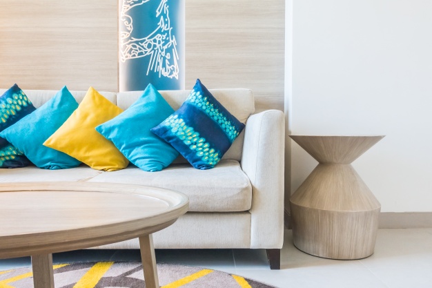
Everybody loves pillows because they are cozy and are a good way to fill up your space. With the pillows already in your house, you can arrange them either on your sofa or on the floor in a creative pattern by contrasting their colors, patterns and sizes in a way that they complement each other. You’ll be surprised by the new and amazing look your room will have,
Use your curtain to fake a high ceiling
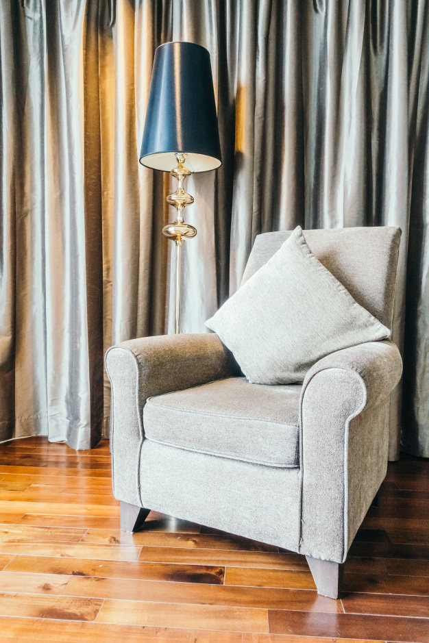
We can all agree that low ceilings don’t look as good as high ceilings and will often limit your ability to make your room appear vibrant. Well, there is a workaround. The trick is using your curtain to fake a high ceiling through installing your curtain rod above your window frame, then installing curtains that go all the way to the floor. This will help your room appear taller than it actually is.
Move furniture from the wall
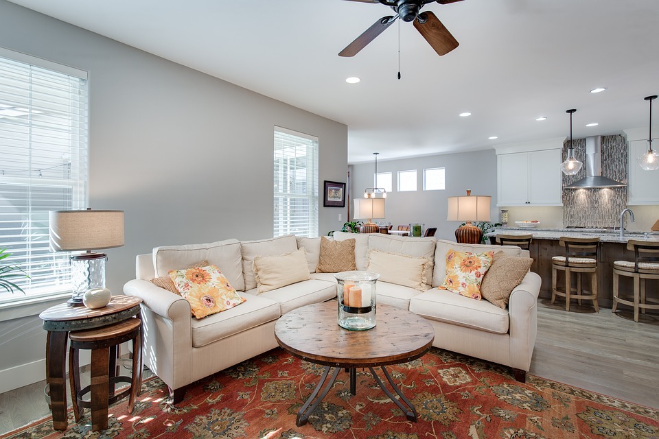
Most people will often place their furniture right next to the wall and this is often not a good idea. It’s actually advisable to place your furniture a couple of feet from the walls, ensuring that you place them in groupings. This will help make your room appear larger.
Let your room have a focal point
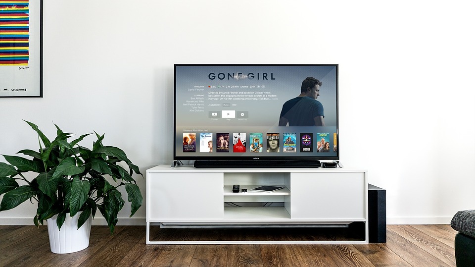
One thing about design is that it’s never random. There has to be a main section in your room that grabs the attention of your audience for instance your TV set, a fire place, a piece of art and so on, then have smaller pieces that complement your center of attention. All you need to do is move things around to achieve this.
These are simple home décor ideas that will not require you to spend any extra money as they mostly involve moving around furniture that you already have in place in your home.
Be sure to try them out.

